Unlock the potential of your Notion workspace by learning how to effortlessly create and customize Notion charts. In a data-driven world, visualizing information is essential for effective decision-making and organization. This guide will help you transform raw data into visually appealing graphics that enhance your pages and streamline your workflow, allowing you to turn complex datasets into clear insights.
As you explore this guide, you’ll discover how to choose the right chart type—be it column, bar, line, or doughnut—and customize it for maximum impact. Each step will empower you to make the most of your Notion workspace, from selecting appropriate visuals to tweaking colors and layouts for clarity. By the end, you’ll have the skills needed to create compelling visual narratives that elevate your productivity and organizational efficiency.
Table of Contents
ToggleCreating Your First Chart: Step-by-Step
To get started with Notion charts, navigate to the section where you want to place your chart. Begin by typing the slash (/) command and searching for the chart option. You will see several types of charts available: vertical bar, horizontal bar, line, and donut. Choose the type that best fits your data visualization needs.
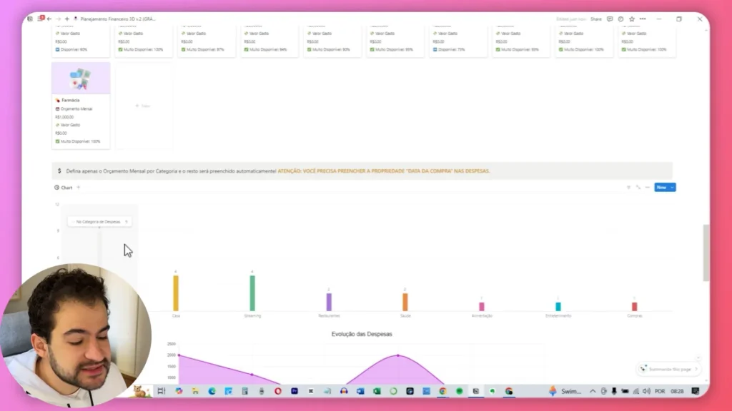
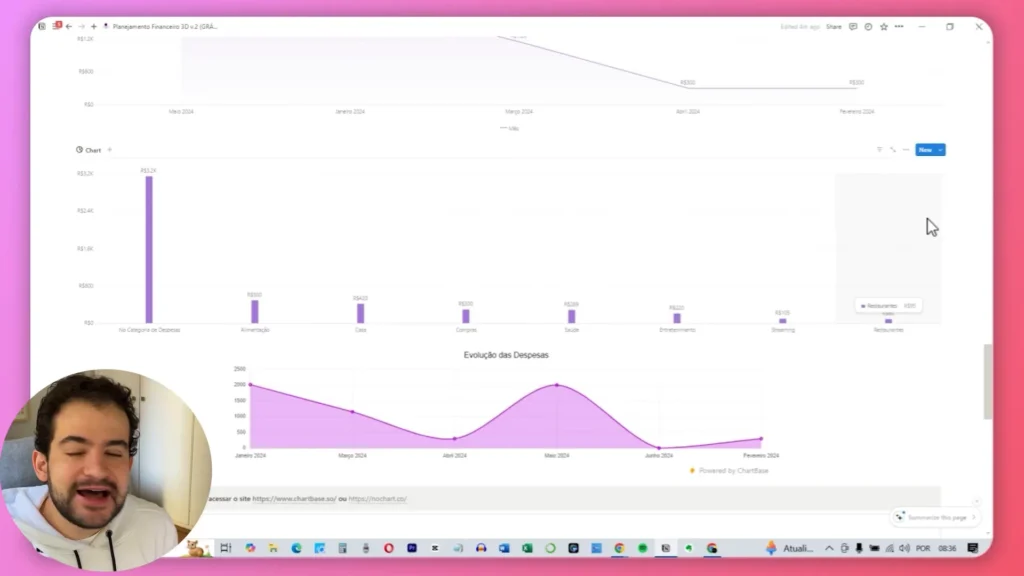
For our first example, let’s create a vertical bar chart. Select this option and choose the database that contains the data you want to visualize. In this scenario, we will focus on expenses. The chart will automatically filter data based on payment methods, which will appear on the x-axis.
Next, customize your chart by selecting what information you want to display. Instead of payment methods, switch to categories of expenses. This change will provide a clearer overview of where your money is going. By categorizing your expenses—such as groceries, utilities, and entertainment—you can easily identify spending patterns and make informed financial decisions.

To maximize the effectiveness of your Notion charts, employing the filter function to sort your data from highest to lowest is a strategic move. This approach significantly enhances the visual impact of your chart, allowing you to quickly identify your biggest expenses and gain valuable insights into your spending habits.
Customizing Your Chart’s Data and Appearance
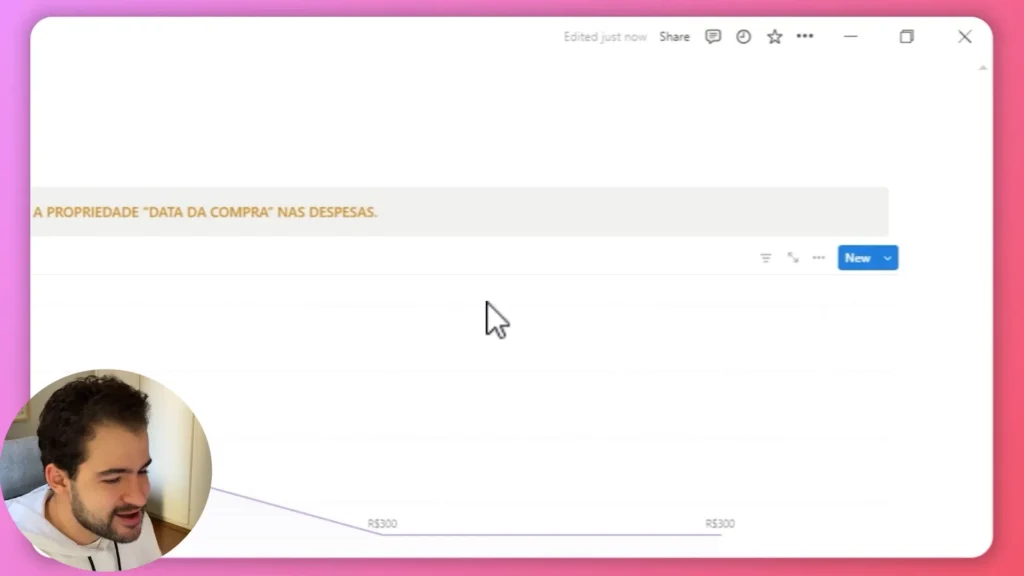
One of the standout features of Notion charts is their high level of customization, allowing you to tailor your visualizations to meet your specific analytical needs. When creating a chart, you have the option to display either the count of expenses or the total amount spent. For a more insightful analysis, opting for the total amount is highly recommended. This choice enables you to see exactly how much you’ve spent in each category, making it significantly easier to track your financial habits and identify areas where you may need to adjust your spending.
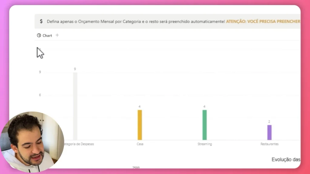
In addition to choosing what data to display, you can also hide categories with zero values. This feature helps streamline your chart, removing unnecessary clutter and allowing you to focus solely on the relevant data. By eliminating empty categories, your chart becomes clearer and more impactful, making it easier for you to draw conclusions from your financial data.

Notion also allows you to switch between different chart types effortlessly. For instance, if you want to visualize the same data in a line chart instead of a bar chart, simply select this option and follow a similar process of customization. Line charts are particularly useful for tracking trends over time, as they illustrate how your spending evolves.
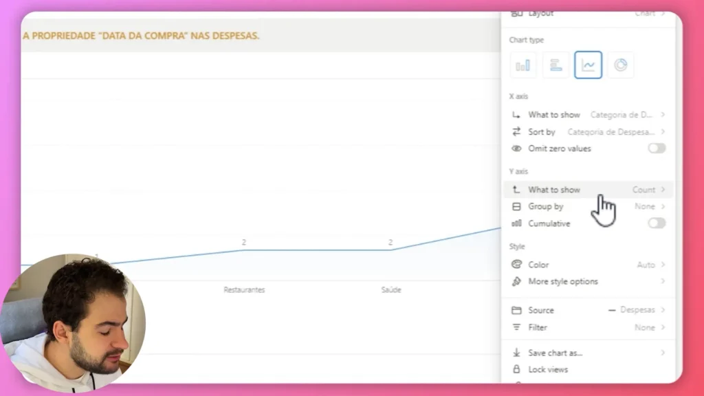
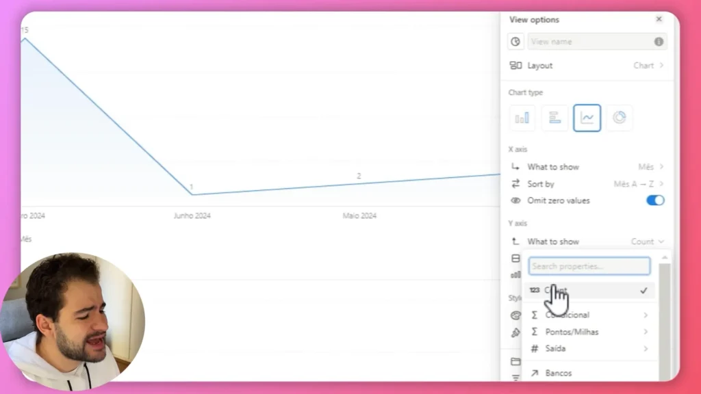
When creating a line chart, you can choose to display data by month, which helps track your spending trends over time. This feature provides a broader perspective on your financial activities and can highlight seasonal spending habits or significant changes in your expenditure patterns.

To get the most out of your visualizations, remember to adjust the sorting and filtering options accordingly. With just a few clicks, you can see how your expenses fluctuate month by month. This capability offers valuable insights into your financial planning and helps identify patterns that may inform future budgeting decisions. By customizing both the data and appearance of your charts in Notion, you can create powerful visual tools that enhance your understanding of personal finances and support more informed decision-making.
Understanding the Dashboard Features
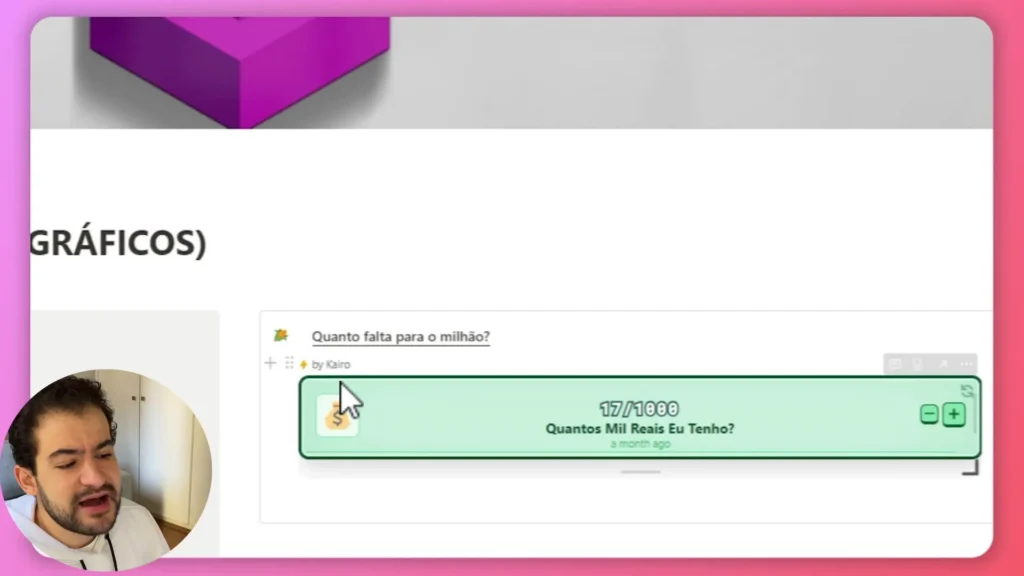
The financial planning template in Notion offers a comprehensive dashboard that effectively tracks your income, expenses, investments, and remaining balance. This dashboard is essential for maintaining oversight of your financial health, providing a centralized location where all critical financial information is easily accessible. With its intuitive layout, you can quickly assess your overall financial situation at a glance, ensuring you stay informed about your economic standing.
Within the dashboard, you can view summaries of your total accumulated income, expenses, and savings. This information is crucial for making informed financial decisions and setting realistic budgets. By having these key figures readily available, you can identify trends in your spending habits and income flow, allowing you to adjust your financial strategies accordingly. For instance, if you notice that your expenses are consistently higher than your income, you can take proactive steps to cut back on unnecessary expenditures or explore additional income sources.
Utilizing this dashboard alongside your charts enhances your ability to visualize trends and patterns in your finances. The combination of numerical data and visual representations allows for strategic adjustments based on real-time insights. By regularly updating your data—whether it’s recording new expenses or tracking investment performance—you ensure that both your charts and dashboard reflect your current financial status accurately. This ongoing process not only keeps you informed but also empowers you to make better financial decisions.
Incorporating charts into your financial planning template not only enhances your understanding of your expenditures but also provides a powerful tool for analyzing and interpreting data. The ability to visualize data in Notion transforms complex numbers into clear graphics, making it easier to spot fluctuations and identify areas for improvement. By leveraging these features effectively, you can cultivate a more proactive approach to managing your finances, ultimately leading to greater financial stability and success.

Advanced Chart Customization Options
Notion charts offer a plethora of customization options that allow users to tailor their visuals to meet specific needs. Beyond simply selecting the type of chart, you can adjust various settings to enhance both clarity and visual appeal. This level of customization ensures that your charts not only present data effectively but also align with your personal or organizational branding.
For instance, you can modify the axis labels to make them more descriptive and relevant to your data. Clear labels help viewers understand what each axis represents, reducing confusion and improving the overall readability of the chart.
Additionally, choosing different color schemes can significantly impact how your data is perceived. A well-thought-out color palette can highlight key trends or categories, while contrasting colors can draw attention to critical data points. Moreover, adjusting the size of the chart allows you to fit it seamlessly into your Notion page layout, ensuring that it complements other elements without overwhelming them.

Another valuable feature is the ability to add data labels directly to your charts. This function provides immediate information at a glance, ensuring that viewers can quickly grasp the significance of the data points represented. By displaying values directly on the chart, you eliminate the need for viewers to interpret the data solely from the axes, making it easier for them to understand trends and comparisons. This is particularly useful in presentations or reports where quick comprehension is essential.
Furthermore, you can explore additional customization options such as adjusting gridlines for better visual separation of data points or incorporating tooltips that provide extra context when hovering over specific areas of the chart.
Types of Charts Available in Notion
Notion provides several chart types to cater to various data visualization needs. Understanding each type can help you choose the right one for your specific scenario, ensuring that your data is presented in the most effective way possible.
- Vertical Bar Chart: Ideal for comparing quantities across different categories, this chart provides a clear visual distinction between data sets. It’s useful for quickly assessing differences in values, such as task completion by team members.
- Horizontal Bar Chart: Similar to the vertical bar chart, the horizontal bar chart is best for lengthy category names, enhancing readability. It’s effective for comparing data like the effectiveness of various advertising channels.
- Line Chart: Perfect for showing trends over time, the line chart connects data points with lines, making it ideal for tracking changes in metrics such as stock prices or daily activity levels.
- Donut Chart: A visually appealing variant of the pie chart, the donut chart displays proportions of a whole while allowing space in the center for additional information. It’s great for illustrating budget allocations or market shares.
Understanding Notion’s Pricing Plans for Charts
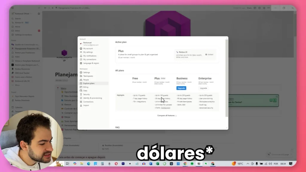
When considering the use of Notion charts, it’s crucial to understand the pricing structure associated with the platform. Notion offers various subscription plans, and the availability of chart features is contingent on the tier you choose. The basic plan, which is free, does not include chart functionality, meaning users must upgrade to at least the second-tier plan to access these essential features.
The second-tier plan, often referred to as the Plus plan, typically costs around R$ 12 per month. This plan not only provides access to chart features but also includes additional benefits such as unlimited file uploads and a longer page history. For users who rely heavily on data visualization and want a more robust tool for managing their information, investing in a premium plan is worthwhile. It enhances the functionality of your Notion workspace and significantly streamlines your workflow.
For teams or individuals who frequently analyze data, the investment in a higher-tier plan can lead to improved insights and better decision-making capabilities. With advanced charting tools at your disposal, you can create compelling visual representations of your data that facilitate understanding and communication. Ultimately, selecting the right pricing plan ensures that you have all the necessary tools to maximize your productivity in Notion.
Benefits of Using Notion Charts for Data Visualization
Incorporating Notion charts into your workspace can dramatically enhance your data visualization capabilities. Here are some of the key benefits:
- User-Friendly Interface: Notion’s intuitive interface makes it easy for anyone to create and customize charts without needing advanced skills.
- Real-Time Updates: Charts automatically update as you modify the underlying data, ensuring your visuals are always current.
- Seamless Integration: Notion charts integrate smoothly with other Notion features, allowing for a cohesive workspace experience.
- Enhanced Clarity: Visual data representation can simplify complex information, making it easier to identify trends and insights.
Conclusion and Final Thoughts
As you explore the world of Notion charts, it’s essential to recognize the vast potential they offer for enhancing your data visualization efforts. Whether you’re tracking finances, monitoring project progress, or analyzing any other metrics, the ability to create customized charts can significantly transform your approach to data management. These visual tools not only provide clarity but also empower you to communicate insights more effectively.
Investing time in mastering Notion charts will undoubtedly pay off in the long run. A well-organized workspace that incorporates effective visualizations is not only more functional but also more visually appealing. By taking advantage of the extensive customization options available, you can create visuals that resonate with your audience, making your presentations more engaging and informative.
In conclusion, Notion charts are a powerful asset that can elevate your data presentation and analysis capabilities. With the right approach and a willingness to experiment with different chart types and configurations, you can leverage these features to make informed decisions and drive better outcomes in your projects. Embrace the power of Notion charts, and unlock new levels of productivity and insight in your work.

